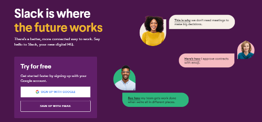
A LANDING PAGE can either be your home page or any webpage created for marketing campaigns. It has a specific objective: to drive visitors to take action towards conversion. We will take a look at the different elements that make landing pages more attractive and valuable to attract visitors to click through till they make a purchase or surrender their information to you.
Determine the goal
Think about the specific purpose you want your landing page to accomplish. Are you looking to promote a product or build an email list? This way you are able to create the right messaging and input the keywords to reach your target audience.
Above the fold
Besides an eye-catching design, you need to place all your most important information above the fold. Why? Because most visitors won’t scroll all the way to the bottom of your landing page. Layout your most valuable and eye-catching headings above the fold. This will bring more hits on your Google ads and drive more clicks to your landing page.
The right image
Convince your B2B buyer that the image shows the actual product. Customers rely heavily on images to choose you over your competitor. They’re more interested in visually enticing images compared to poorly taken product images. Check out our best practices blog about the high-quality images here.
Call to action
Attract customers with a bright and noticeable call to action button, different from the rest of the colours of your landing page. Inform your customer what the call to action is about. Is it an e-book, subscription, or freebie? Ensure a smooth browsing and clicking experience for both mobile and other devices.
Emotional connection
Write killer copy that connects to your customer’s problems and pains. Keep your text simple yet informative enough to address their needs. Most customers would scan through the headers first before deciding to continue reading. Have enticing headers to build emotional connection, giving your customer a reason to read on and to take the desired action i.e. click on the call to action button.
Conclusion
Use these elements to tweak your layout, images, copy and design to fit your brand. Make sure that all elements remain cohesive for a landing page that converts.
Have any queries about how to use your online presence as a growth engine for your wholesale business? Contact us at sales@zooloo.asia.
- Previous blog on How to build a RETURN POLICY Page?
- Read about The Digital Transformation Journey
- Learn more about our “Digital Backbones”
- Learn more from our eBook series on Digital Transformation for Wholesale Trade
Tags: #CRM #MicrosoftDynamics #Dynamics365CRM #digitaltransformation #B2B #digitaladoption #digitalintegration #digitalsolutions #wholesaletradesector #wholesaletrade


